Final Project- Female Empowerment

Exhibition Assignment, Uncategorized

For our final project, we had to pick a theme to create a body of work a final piece to exhibit. I was initially hesitant to pick Feminism as a theme, because I feel that since it is a popular subject for artists and designers, it is very hard to create a memorable piece of work that will stand out amongst others. Also, I believe that it is a theme that can often lead to a negative or upsetting conclusion. I wanted my final project to be optimistic, empowering, and bright, so my first challenge was to deliver the Feminist message by keeping it positive.

I created a lot of light- hearted colourful illustrations in my sketchbook, whilst researching female artists such as Kate Morros, Frida Kahlo, and Barbara Kruger. I used a lot of bright colours and simple shapes. I was sure to make sure that all of these illustrations had positive and playful messages.

For the exhibition, I wanted to create a big piece, because along with the simple block colours I used I believed that it would stand out. I ended up creating two 4×4 foot paintings that I believe maintained the theme that ran through the whole project. Most importantly,, I am very happy with the way my pieces turned out.

90 Second Mirror- Using Adobe Premier Pro

Creative Futures, Uncategorized

About my video:

The brief was to create a 90 second film on Adobe Premier Pro that was a reflection of our selves and how that influences our work. Recently, my work has been inspired by where I live- in a village surrounded by the natural beauty of Snowdonia. I also always use bright colours in my work which contradicts the muted tones in natural landscapes. I am drawn to neon lights such as the ones in my film due to the bright colours. By combining clips of the landscape that I live in and some clips of bright neon lights, I think it represents the conflict of interest in my artwork and inspiration points.

How I made it:

To start the 90 second mirror video brief on Adobe Premier Pro, we first had to insert all of our video clips into Premier Pro. we did that by creating a new sequence and creating a ‘bin’ where all of the clips are stored. We then had to add them into the timeline to start creating the actual video. Screen Shot 2018-02-20 at 14.18.01
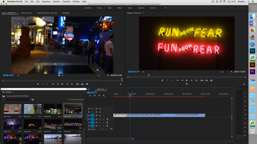
In this screen capture, you can see that I have put all of the clips I wanted into the timeline, and I also removed the audio so just for the time being so I could get used to working with video.Screen Shot 2018-02-20 at 15.07.00
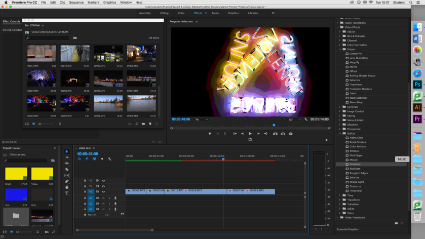
I then started playing with some of the video effects that Premier has to offer. There were some that made drastic changes to the clip it was applied to, and there were some that had a barley noticeable change on it, but I decided to go with the effect ‘Posterize’, since I believe that it emphasised the bright coloured light in the clips I was working with.

Screen Shot 2018-03-13 at 13.24.21
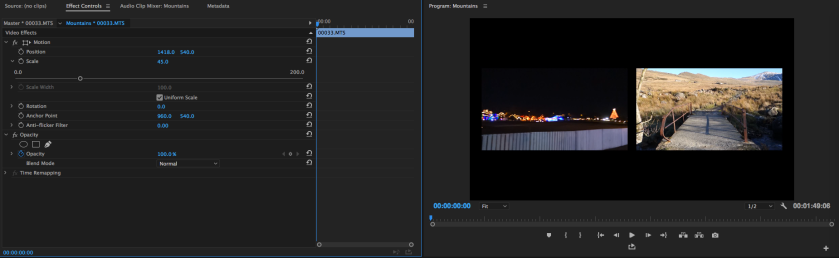
Since my video combines to elements that are complete polar opposites to each other, I learnt how to create a diptych, where both of the clips were playing at the same time. I did this by layering up the clips in the timeline and then adjusting  the size of the clips so both were the same size and evenly split.

Screen Shot 2018-03-13 at 14.05.06
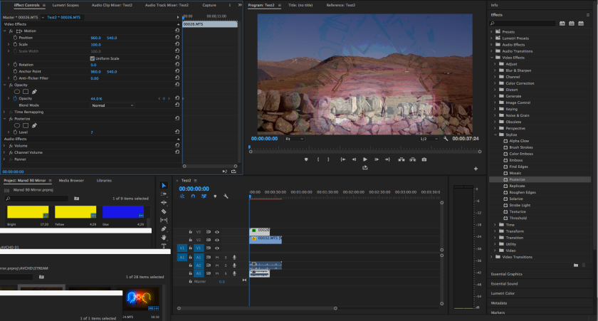
I later decided that creating a diptych meant that there was a bit too much separation between both elements of the video, so instead, I layered both video clips and altered the opacity of the clips with the lights. I did it this way because the lights were so strong and on a dark background the opacity let the light through clearly, but the mountains in the other clips were obvious as well.

Screen Shot 2018-03-13 at 15.19.33
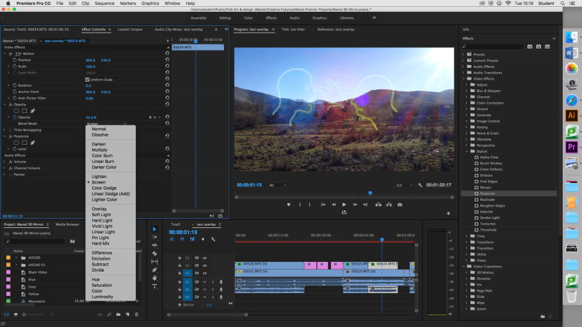
Later on, I discovered that an easier way to merge both clips into one was through changing the bend settings some created little patches in the clip where the other came through, and some had a really similar effect to changing the opacity. I chose the ‘screen’ blend because it just strengthened the lights slightly more than what they were when adjusting the opacity.Screen Shot 2018-03-13 at 14.52.01 
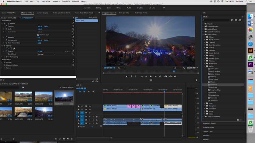
I had also decided to add the audio back by this point, overlapping the busy noise of the light clips with the sound of the countryside. I then cut the light clips out completely along with its audio at certain point which gives the countryside clips a very peaceful contrast.

Screen Shot 2018-03-13 at 15.52.13
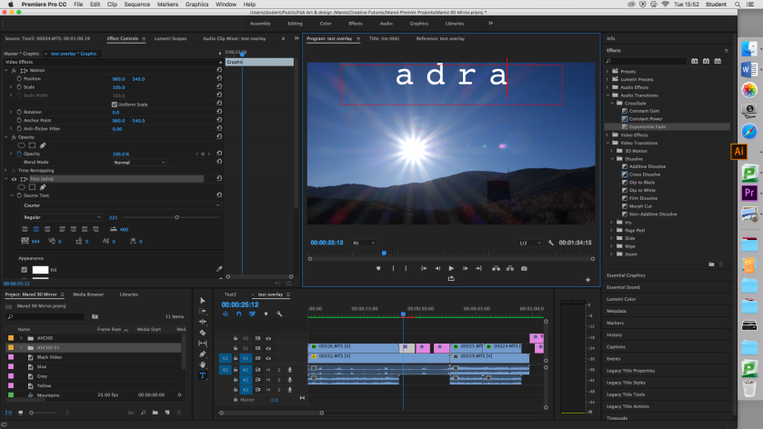
I then added some text to the video, just to underline the important aspects of the video, such as the word adra (home) on top of the clip of the mountain. I used the typeface Courier, because of its simplistic and clean appearance. I also increased the gapping in between the letters to make it a bit bolder. I finished my video off by adding some cross dissolves to the video and audio to making it flow.

Here are some stills of my 90 Second Mirror Film:

See the full video here: https://youtu.be/mCX2OOdlD_Q

Visting London

Creative Futures, Industry Practice, Uncategorized

We recently went on a short 3 day visit to London, where we visited as many galleries as we possibly could. This included the Design Museum, The Tate Modern, the V&A, and the Photographer’s Museum.

Exploring these museums meant an overload of art and inspiration, so here are a few pieces of work that I took particular interest in.

Guerrilla Girls:


Bruce Nauman:

Visiting Texas (Houston/Austin)

Creative Futures, Industry Practice, Uncategorized

The week before Christmas, I was lucky enough to fly out to Texas for a week with some friends. Although we were only there for a week, careful planning and an endless sugar-charged energy supply allowed us to make the most of our short stay and receive the best experience possible.

As an art student, I think the first thing I noticed when we arrived at Houston was the architecture. With the USA being a relatively new country in the grand scheme of things, all of the buildings were made out of concrete with flat roofs, giving  the area surrounding the centre of the city a rather dull atmosphere. In the city centre though, it was similar to any other big city at Christmas time- bright lights everywhere making the city look magical.

While we were in Houston we managed to see many attractions such as the Natural History Museum, the Aquarium, the NASA Johnson Space Centre, and the Houston Museum of Fine Arts.

The Fine Arts Museum really gave me a perspective of the culture in Texas, and the USA as a whole as there was an exhibition showing that was based on the theme of ‘Home’. This exhibition consisted of Latin American artists conveying a variety of different stories, such as the crossover of living in North America as a Latino, The poverty that faced them in South America, and the feelings they had towards their home countries.

The Natural History Museum and the Aquarium were visually arresting places. The Natural History Museum had everything from colourful gems and precious stones to incredibly detailed fossils and massive skeletons. This was an endless source of inspiration. We were also able to sit through a show in the planetarium which was fantastic. The Aquarium, although reasonably small, was also full of colour and neon lights.


The NASA Johnson Space Centre is somewhere I have wanted to go since being a little girl, so having the opportunity to go was amazing. Again, the centre was incredibly visual, with pieces of rocket suspended from the roof. We were able to go see the rocket Saturn 5, which was colossal.


We also stayed in Austin for a part of the week, a city that is completely different to Houston. Austin is more of a student city, which meant that everywhere seemed to concentrate on aesthetic. While we were there we went to Baylor Street, where there are street art walls up on the edge of a hill by the road. As someone who enjoys working with bright colours, I loved walking up and down the walls discovering hidden pieces of artwork. It felt like an urban art gallery.


One night, we went to the Austin Trail of lights- a Christmas light trail that was set up in a local park. This was a light trail like I have never seen before. Every single tree was wrapped in different colour lights, and there were tunnels made purely out of fairy lights, as well as a Christmas Market.


Although we were only there for a week, my first trip to the US was incredibly inspirational. Not only was I able to see lots and lots of art, the atmosphere and people I met were enough to inspire anyone.

Competition Brief

Industry Practice, Uncategorized

For the Industry Practice Module, we told pick a D and AD New Blood Awards competition brief. We didn’t have to enter the competition, but we had to follow it as if we were. I chose a brief that was in partnership with Adidas.

The brief was to chose a issue that is facing 17-25 year olds living in cities, and to create a campaign, product, service, or brand experience that Adidas could provide to help solve it. As this was a competition working with a real brand, there were certain rules to follow:

  • We had to pick a city that already has an Adidas base there, which are London, Paris, Berlin, LA, New York, Shanghai, Tokyo, and Moscow. I chose London as it is the closest and we were going on a college visit there in the next few weeks.
  • The sport or sports that featured in our work had to be sports that Adidas already have links with, such as running, climbing, football, basketball, and so on.
  • It was important to take into consideration that Adidas is a massive brand and although ideas should be realistic, such a big company can afford to do a lot of things.

As I live in a massively mountainous and rural area, when I go to cities, I always notice how flat the land is compared to where I grew up. I then realised, if my 16 year old brother has never been to London, the chances are plenty of 17-25 year olds have never left their city. This gave me my issue- The fact that some young people have never experienced the rural outdoors.

I then started my research and discovered that Adidas have an outdoor sport range called Adidas TERREX that specialise in trail shoes, climbing clothing, and all kinds of other gear designed especially for extreme conditions. This meant I could proceed to design a campaign that highlights the chosen issue.

I started with the idea of bringing the mountains to London. To do this, I quite literally brought the mountains to London by PhotoShopping photos of Snowdonia with photos of the London skyline, making it look like behind London, there was a mountain range. I then went on to put an image of Snowdon in Piccadilly Circus, which is something that is quite plausible if this was to actually happen.

I decided that I was designing a campaign for the brief, so I created magazine spreads in InDesign using the images I had of London and of Snowdonia. I experimented with putting images into text and experimenting with space.

I decided that the spreads I had designed were a bit too busy, so to simplify them I decided to make them a little more graphic. I did this by creating silhouettes of London and Snowdon, and took it from there. It then developed into me making a graphic image of Snowdon on Illustrator which worked really well.

Designing a Logo

Design Communication, Uncategorized

A college-wide brief was handed out to design a new logo for the Creative Arts sector of the college. There was no strict specifications, only that the logo had to represent all areas of the college’s Creative Arts sector- Art and Design, Music, Game Design, and Performing Arts.  The logo also had to be designed on illustrator in order to change the size of the logo for different purposes.

Since we had to cover so many different areas of the Creative Sector, I decided to keep my logo as simple as possible. I also thought that it should be colourful and playful, because the creative arts to me represent individuality and expressiveness which will not come across in a dull logo.

I decided to create a simple bush stroke as a background to the words ‘Creative Arts’ in English and Welsh in the typeface Chalkduster. I decided on this because although it doesn’t represent all of the areas of the sector, it has the ability to suggest creativity without focusing on one area in particular. I chose the Chalkduster as a typeface because it is a legible but playful font, and suggests that feel of a handwritten word.

Work Experience at Cwmni Da

Industry Practice, Uncategorized

Cwmni Da, is a Welsh TV production company based in Caernarfon, and over the half term, I was lucky enough to go for a week work experience to the graphics department.

While I was there, I got to work with software I was already familiar with, but rather than use it for purely for creative purposes, I was taught to use it for more practical reasons. For example, rather than use PhotoShop to create something, I was told to use it to edit photos to go on the social media pages for an upcoming TV program. I was also taught the importance of knowing about the ‘boring’ side of graphic design, such as what type of file to save a document as, the importance of the amount of pixels per square inch in relation to the quality of the document, and so on. I was also lucky enough to be able to use the company’s account on lynda.com to do an online course on PhotoShop. I also sat in on a meeting about the creation of website, where I was able to see the layout and format of a future webpage, and how it corresponds with

On my second day, I was able to sit in with an editor in an editing  suite and watch him edit a short educational video. I was taught about how he was able to cut all the ‘um’s and ‘ah’s out of the clip, but still make it look seamless. I was also told that an easy way to cover up any obvious cuts is to put a still image over it. I was also taught how to search for royalty free images using Flickr.

The third day consisted of learning how to subtitle a video using a special software. It was simple enough to use, and required lining up the text to the right timestamps in the audio of the video.

Unfortunately, I was unable to complete the full week due to illness,  but I still learnt a great deal.  As well as new skills, I learnt that it is ok to take it in to your own hands to learn how to use a new piece of software. I also learnt the importance of knowing the technical side of the software used to create such creative pieces of work.


Paratoi am Arddangosfa- A post in Welsh

Design Communication, Uncategorized

Wrth baratoi am arddangosfa mae hi’n bwysig iawn ystyried sawl ffactor. Rhan o’n briff oedd arddangos y gwaith a gafodd ei greu ar gyfer modiwl cyntaf y flwyddyn- modiwl wedi’i rannu i fewn i 3 briff gwahanol. Roedd  hyn yn creu sialens, oherwydd roedd rhaid dewis pa ddarnau o waith i’w roi fyny allan o’r holl waith celf a gynhyrchwyd rhwng y tri briff.

Gan fy mod i yn creu fy ngwaith yn bennaf drwy gyfrwng digidol drwy weithio gyda rhaglenni fel Photoshop ac Illustrator, fe benderfynais argraffu fy narn gorau o pob briff yn broffesiynol ar papur maint A2. Yna, fe gosdais nhw ar fy’n wal, gyda dim byd arall o’u cwmpas. Mae fy’n ngwaith i yn lliwgar a llachar, felly teimlaf bod dim angen rhoi ddim byd arall i fyny gyda nhw, rhag ofn tynnu’r sylw i ffwrdd o’r brif ddarnau.

I wella’n arddangosfa mi fuaswn yn gludo yr argraffiadau ar darn o gardfwrdd cyn eu gosod ar y wal, er mwyn gwneud yn siwr bod yr argraffiadau yn aros yn llyfn a syth.

arddangosfa


The Beauty Myth

Contextualising Design, Uncategorized

There is no way to deny the fact that the portal of women in media is one of the biggest issues in today’s society. ‘The Beauty Myth’ is a novel written by Naomi Wolf where she analyses the theory that digital media is turning women to hate themselves.

The first artistic portrayal of a woman is believed to be Venus of Willendorf, created in 2800 BC. No one really knows who this woman is, but it is most likely to be a religious icon such as a Goddess. The woman has a rounded and full figure and is completely nude. She is also faceless.

venusThousands of years later and the women we now see in day to day media are a far cry from the curvaceous Venus of Willendorf. A desirable woman is now thin, tanned and flawless. This has a massive impact on the mental state of young women- they feel that they have to live up to what society has labelled an ‘ideal woman’.

‘A culture fixated on female thinness is an obsession about female ‘obedience” – The Beauty Myth, Naomi Wolf

This quote perfectly explains how the obsession with female appearance forces the progression of equality for women backwards. Women have become slaves to diets, fitness regimes and miracle working products that the corporate world force upon us through Photoshopped adverts of already beautiful young women.

victoria secret ad

This day and age, we boast about how we have progressed from the extraordinarily sexist attitudes of the early 90’s, but have we really changed? We are still presenting women to the world in very derogative manner. We are a society that call ourselves Feminists, but are we really that different?

Magazines- Vogue or Adbusters?

Contextualising Design, Uncategorized

The legacy of late Modernism encourages designers to distance themselves from social issues. Graphic Design became a tool for corporate design, rather than to draw attention to political and social messages. This detachment has been inspired by the Modernist beliefs, which were:

-desire for universal form

-abstraction

-rationality

-objectivity over subjectivity

This led to the rise of advertising. Advertising is now everywhere, and graphic design has become an art form linked to the corporate world, rather than the artist’s emotion and opinion.

An area where advertising is possibly most effective is magazines-more specifically, fashion magazines. Some of the biggest magazines such as Vogue sell prime advertising spaces in the front pages of their magazines for around $200,000.00 give or take for a full colour spread. These advertising spaces are typically, taken by high end beauty and fashion companies which means that before readers even get to the actual content of the magazine. The target audience for these types of magazines are normally young women, who are generally vulnerable to the pressures that society puts on looking a certain way.

vogue spread

Although all mainstream magazines contain ads and featured products put there to capitalise on people’s desires, there are some design orientated magazines that focus on bigger, more important social and political issues. A good example of this is the magazine Adbusters. As the title suggests, they have gotten rid of all the ads that might feature in a normal magazine, and instead outline important social and political issues through their dark humour.

adbusters spread

Despite the difference in content, both magazines have one thing in common- they use the aesthetic of their design to draw the reader in. Vogue have a more conventional layout- using columns, clean cut pages and big, beautiful editorial shoots to display a product. Adbusters is on the other side of the spectrum and breaks many ‘rules’ of design by not using columns, using hand written style doodles and distorted imagery to display a social or political issue. I believe that both are beautifully designed, but they are designed for different purposes, and it is important to remember this